We interrupt today's Tech Tuesday for this important message....tutorial......
My Denver BFF and I have a new tradition. Each summer we do one major art project together. Last summer, we made the most adorable burlap garland for her sister's baby shower. This year, string art!
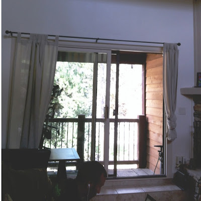
Our condo in Colorado is lovely with really tall ceilings, but it is in desperate need of artwork. The color palette right now is very neutral. We really haven't done much with the wall space. Take this space as an example.
To make the string art, we used this tutorial and this one to guide us. Of course, we learned some tips and tricks along the way - which I will share below.
Ready?
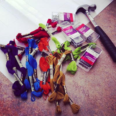
Step One: Gather supplies - Embroidery thread (at least two skeins per letter), hammer, print-out of words (more on this in a moment), tape, hammer, ladder, and nails (we used steel nails from Lowe's. They were 1.25 x 16 size). As you can see from this supplies list, this project is inexpensive. Maybe I spent $12 on all the supplies (we already had the hammer, ladder, and tape).
Step Two: Mark guidemarks on the text printout - I made a "banner" of the text (Hello, Breck) on my PC computer using Microsoft Publisher. I found using Publisher was the easiest as it has a built-in banner option. I chose a clear, slightly thick font and made the letters almost 8.5 x 11 size so the text would be nice and big (and clear). I also chose "outline" for the text, so the letters were outlined and not totally filled in with black (I was trying to save my printer's ink). On each letter, my BFF and I marked the spot where we planned to hammer the nails. That was Mr. UpCyclist's idea and it was quite helpful. TIP: If you want your letters to follow the font you chose and not get too squared, the more nails the better! In fact, my BFF and I ended up added some nails when we thought the letters were looking too squared. Thus, go heavier than you might normally go with your nail placement especially on curved letters.
Step Three: Decide on your color line-up - Lil O was our assistant for this. In the end, we decided not to follow a color pattern and make the colors appear more random. Oh, and sorry about the blurry photo....I really need a "real" camera.
Step Four: Hang the banner - We used a laser level to help us hang the paper banner straight. We also used blue painters tape to affix the banner to the wall.
Step Five: Start nailing! My BFF started from one end. I started from the other. We just nailed directly into the paper banner following the guidemarks we made in step two. I even used a small craft hammer to nail and it was soooo simple. TIP: We found it was best to nail from right to left (meaning, start with the end of the text first). That way your hand/palm doesn't keep rubbing against the nail heads. Yes, you can thank us later for that tip :)
Step Six: Gently pull off the paper - This part was so smooth. The paper came off almost effortlessly. However, we did think it looked so strange. Are there really letters there? It looked like a mish-mash of nails to us.
Step Seven: Start wrapping your embroidery thread - This part was completely enjoyable. I think we both agreed this was our favorite part.
We do have some TIPS for this:
- Use two embroidery threads at the same time to make your lines thicker and the colors pop more.
- We started each wrap in the bottom left hand corner of each letter. However, in the end, we don't think it is noticeable where you tie off your knots.
- Speaking of knots, we used a simple overhand knot to secure the thread at the start and end points.
- We tried to finish each letter in the same spot we started, but that didn't always work out - which was just fine when you use a small, tight knot.
- We started each letter by outlining it twice first (going around each nail in a clockwise fashion). Then, we started filling in each letter with no recognizable pattern - just zigging and zagging.
- Having more nails (vs. less) gives your patterns (and zig-zags) more options. We vote for more nails!
- Simple letters like an "L" require less thread than complicated letters like an "R." Thus, sometimes we used every inch of thread and other times, we did not (as we did not want some letters to look too filled in and others to look more skimpy).
- Every once in a while, we would jump off our ladders to see how the letters looked from afar. But, in the end, this is such a forgiving project.
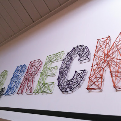
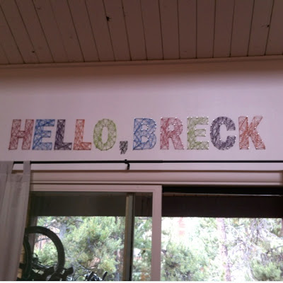
Step Eight: Celebrate! I know it doesn't look like it, but the string art is really centered and the colors are very bright. With breaks and our learning curve, the entire project took us around four hours to complete. When we do it again (notice the "when" part; I loved this project), I think we could knock out similar string art in two hours.
Here's another shot processed in Instagram. The colors are really as bright as they appear below:
To this.....
Yay for string art!
xoxo,


